

Fashion trends and colors are constantly evolving and changing with time.
Based on current fashion trends, it’s possible that some popular fashion colors in 2023 could include:
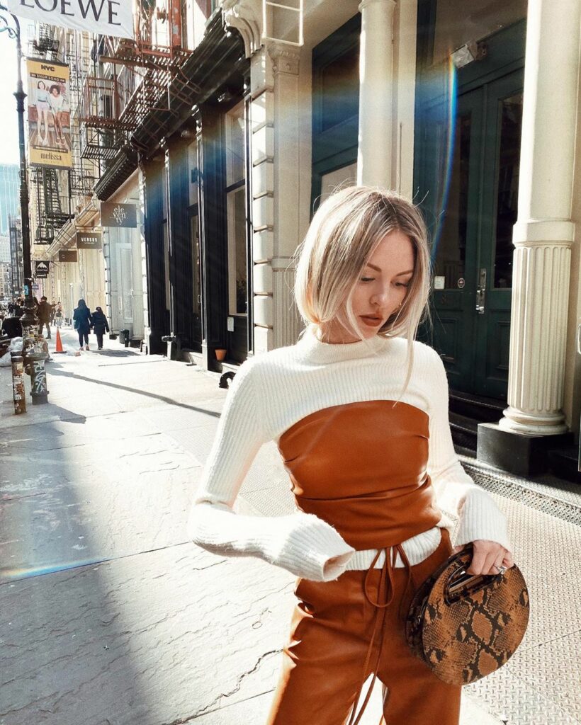
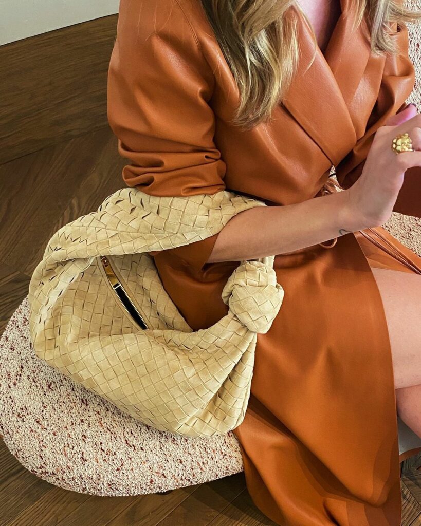
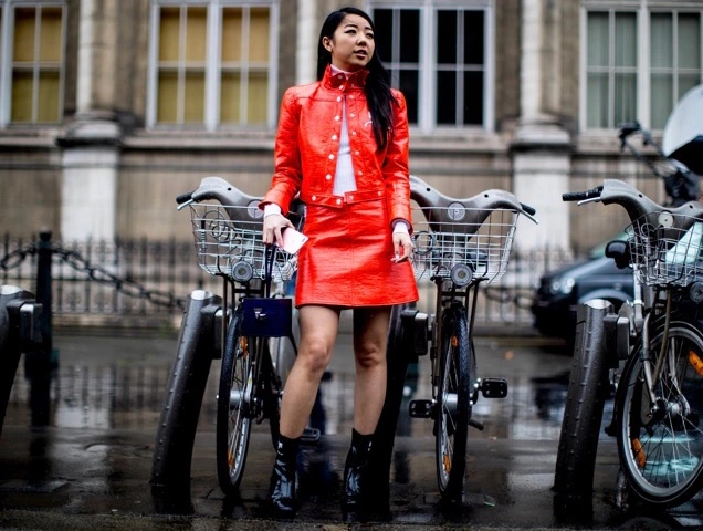
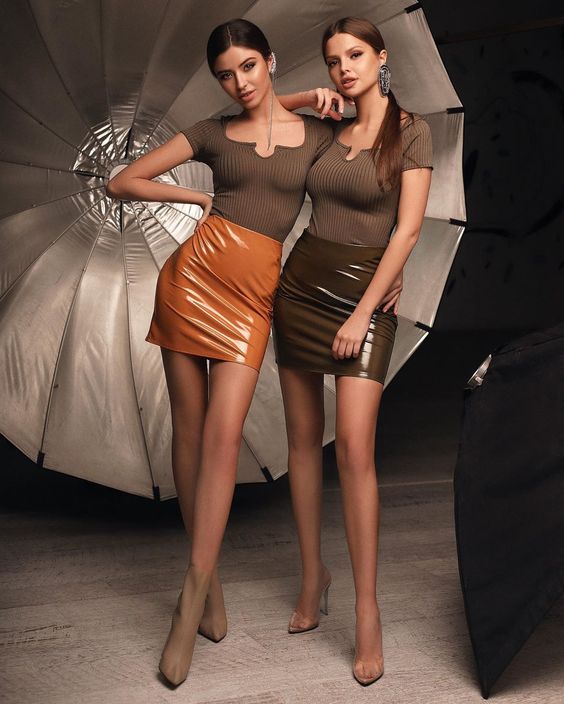
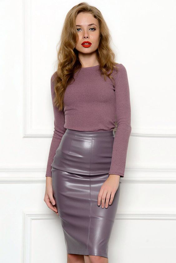
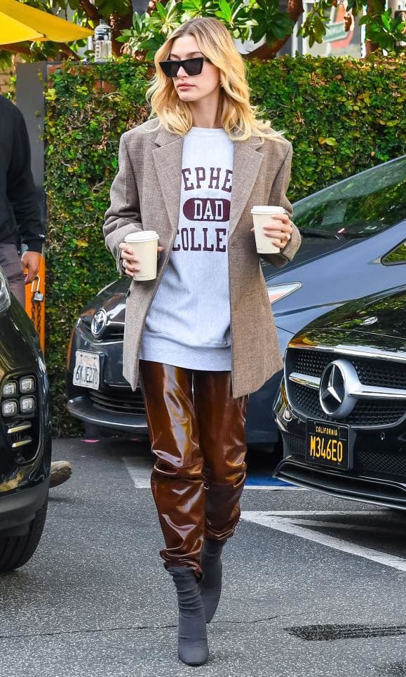
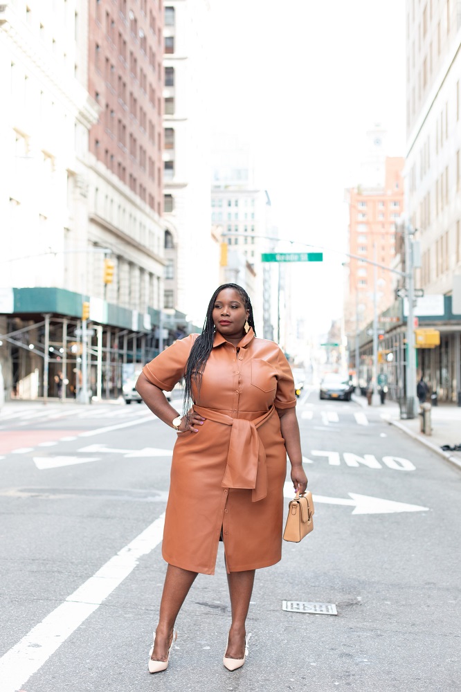
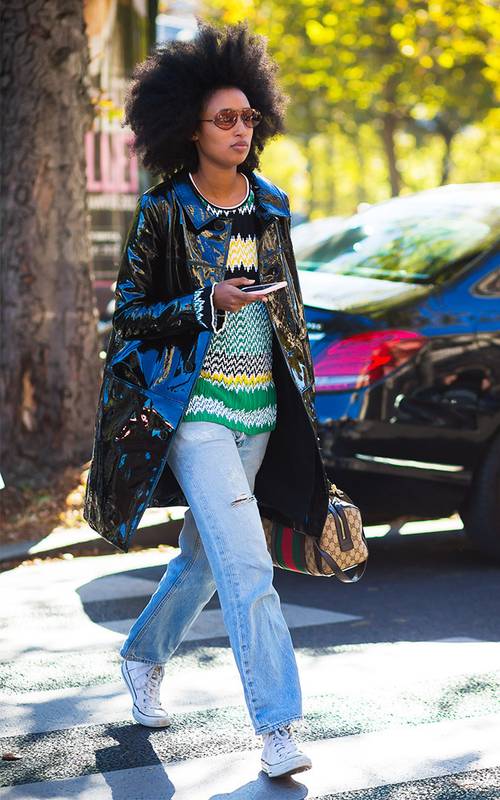
- Earth tones: Shades of brown, beige, olive green, and burnt orange have been trending in recent years, and are likely to continue to be popular in 2023.
- Pastels: Soft, delicate hues like pale pink, lavender, and baby blue are always in style, and are a great choice for a feminine or romantic look. Pink, lavender, and mint green are perfect for spring and summer, and can be worn to outdoor events like weddings, picnics, and brunches.
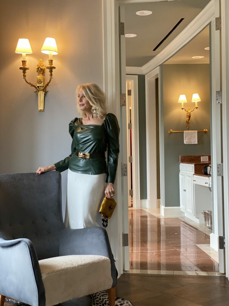
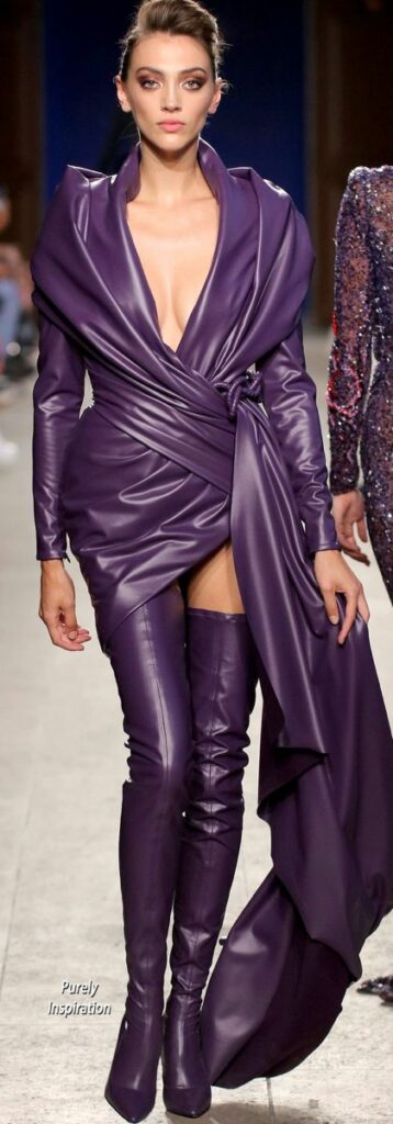
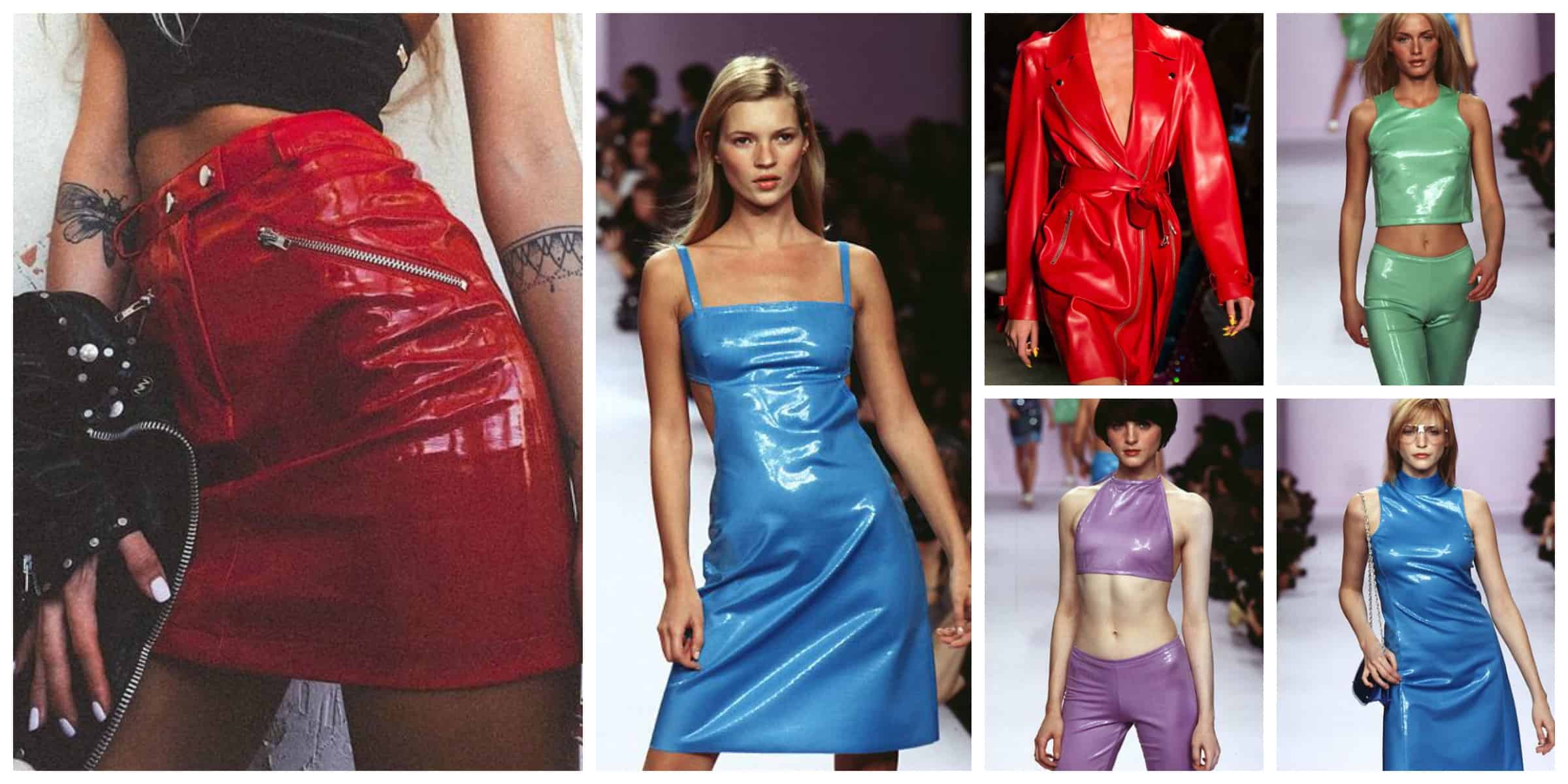
- Jewel tones: Rich, vibrant colors like emerald green, sapphire blue, and ruby red are classic and elegant, and are perfect for special occasions.
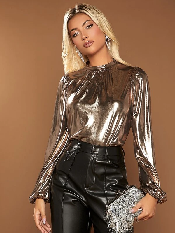
- Metallics: Shiny, reflective colors like gold, silver, and bronze are a great way to add a touch of glam to any outfit.
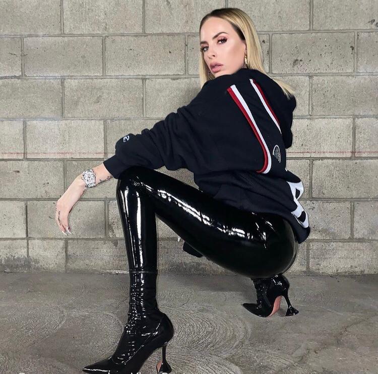
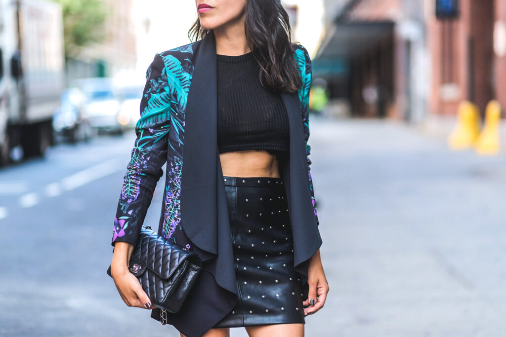
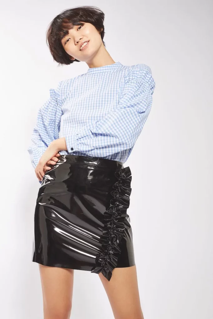
- Neutrals: Timeless shades like black, white, and gray are always in fashion and are versatile enough to be worn in a variety of settings. Neutral colors such as black, white, beige, and gray are versatile and can be worn to a wide range of settings, including work, formal events, and casual outings.
Color is an important element in fashion as it can evoke different emotions, set the tone for an outfit, and highlight certain features or parts of the body. Here are some ways to think about color and fashion – consider your skin tone. Certain colors may complement your skin tone better than others. For example, if you have warm undertones in your skin, colors like yellow, orange, and red may look particularly flattering on you.
Mood and occasion: Another way to think about color and fashion is to consider the mood or occasion you’re dressing for. For example, if you’re attending a formal event, you may want to opt for classic colors like black, navy, or burgundy. If you’re dressing for a fun and playful outing, you may want to choose brighter, more vibrant colors.
Color theory: Color theory is a set of principles used to understand and explain the relationships between colors. It is based on the color wheel, which is a circular diagram that shows the relationships between different colors. Color theory can also be applied to fashion. Complementary colors (colors that are opposite each other on the color wheel) can create a bold and eye-catching look, while analogous colors (colors that are next to each other on the color wheel) can create a more harmonious and balanced look.
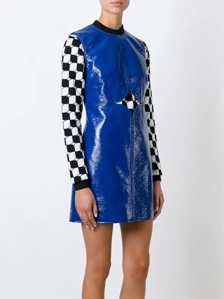
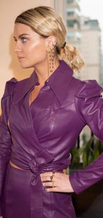
The primary colors in color theory are red, blue, and yellow. These colors cannot be created by mixing other colors. Secondary colors are created by mixing two primary colors together. The secondary colors are orange (created by mixing red and yellow), green (created by mixing blue and yellow), and purple (created by mixing blue and red).
Color theory also includes concepts such as hue, saturation, and value. Hue refers to the purest form of a color, without any tint, shade, or tone. Saturation refers to the intensity or purity of a color, while value refers to the lightness or darkness of a color.

Different color combinations can evoke different emotions and moods. For example, complementary colors (colors that are opposite each other on the color wheel) can create a bold and eye-catching look, while analogous colors (colors that are next to each other on the color wheel) can create a more harmonious and balanced look.
Understanding color theory can be useful in many areas, including art, graphic design, and fashion, as it can help you make informed decisions about color selection and create visually pleasing and effective designs.
Personal style: Ultimately, the colors you choose to wear should reflect your personal style and taste. Don’t be afraid to experiment with different colors and combinations to find what works best for you.
Remember, fashion is about self-expression and creativity, so have fun and don’t be afraid to play with color!


I liked how you grouped earth tones like olive and burnt orange as continuing trends, since those shades have been dominating my fall wardrobe lately and feel easy to mix with neutrals.
Calling out black, white, and gray as suitable for work, formal, and casual settings highlights how practical those staples really are.
The section on jewel tones being ideal for special occasions felt spot on, especially emerald and sapphire which always look polished without trying too hard.
Interesting that you paired pastels like lavender and mint green with events like brunches and weddings, because those softer hues really do feel perfect for daytime spring occasions.
The inclusion of metallics like gold and bronze as a way to add glam was a nice touch, especially for people who don’t want full-on bold colors.
The emphasis on personal style at the end was a good reminder that trends like earth tones or metallics are optional, not rules.
I found the advice about dressing for the occasion particularly helpful, since it’s easy to forget how much color influences how an outfit is perceived.
It’s refreshing to see neutrals like beige and gray highlighted as versatile rather than boring, since they really are the backbone of most everyday outfits.
The part about analogous colors creating a harmonious look gave me ideas for layering outfits without them clashing too much.
The suggestion to experiment with color combinations really ties everything together, especially after explaining the color wheel basics earlier in the article.
I liked that you included both trendy shades like burnt orange and timeless ones like navy, giving a balanced view rather than just focusing on what’s new.
I appreciate how you didn’t just list colors but explained mood and occasion, like choosing black or burgundy for formal events versus brighter tones for playful outings.
Mentioning baby blue and pale pink as timeless pastels felt accurate, since those shades seem to reappear every spring without ever feeling outdated.
I liked how you connected color choices to emotions and mood, which makes getting dressed feel more intentional rather than just following trends.
The reminder about considering skin undertones really stood out, especially the note about warm undertones working well with yellow and red, which explains why some colors always feel off on me.
Your note on jewel tones being both classic and vibrant explains why they’re often seen at evening events and formal gatherings.
Pointing out that pastels work well for outdoor events like picnics made me think about how lighting affects how colors actually appear.
Your explanation of complementary versus analogous colors made it easier to understand how to actually build outfits instead of just picking random shades.
The breakdown of primary and secondary colors was simple but useful, especially for readers who might not have any background in color theory.
I hadn’t thought much about saturation and value before, but your breakdown made it clear how lighter or darker variations of a color can completely change an outfit.